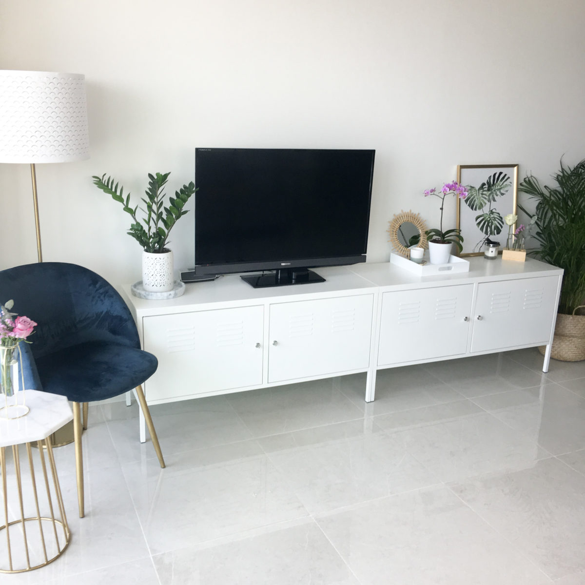
So it’s been two months since Dan and I moved apartments and I thought it was about time I did another interior blog post. We live in quite an open plan apartment so the living, dining and desk space is technically all in the same room. I have previously done a blog post on my desk space, which you can read here, but today’s blog post will focus on the living/TV area of this room :).
TV Unit
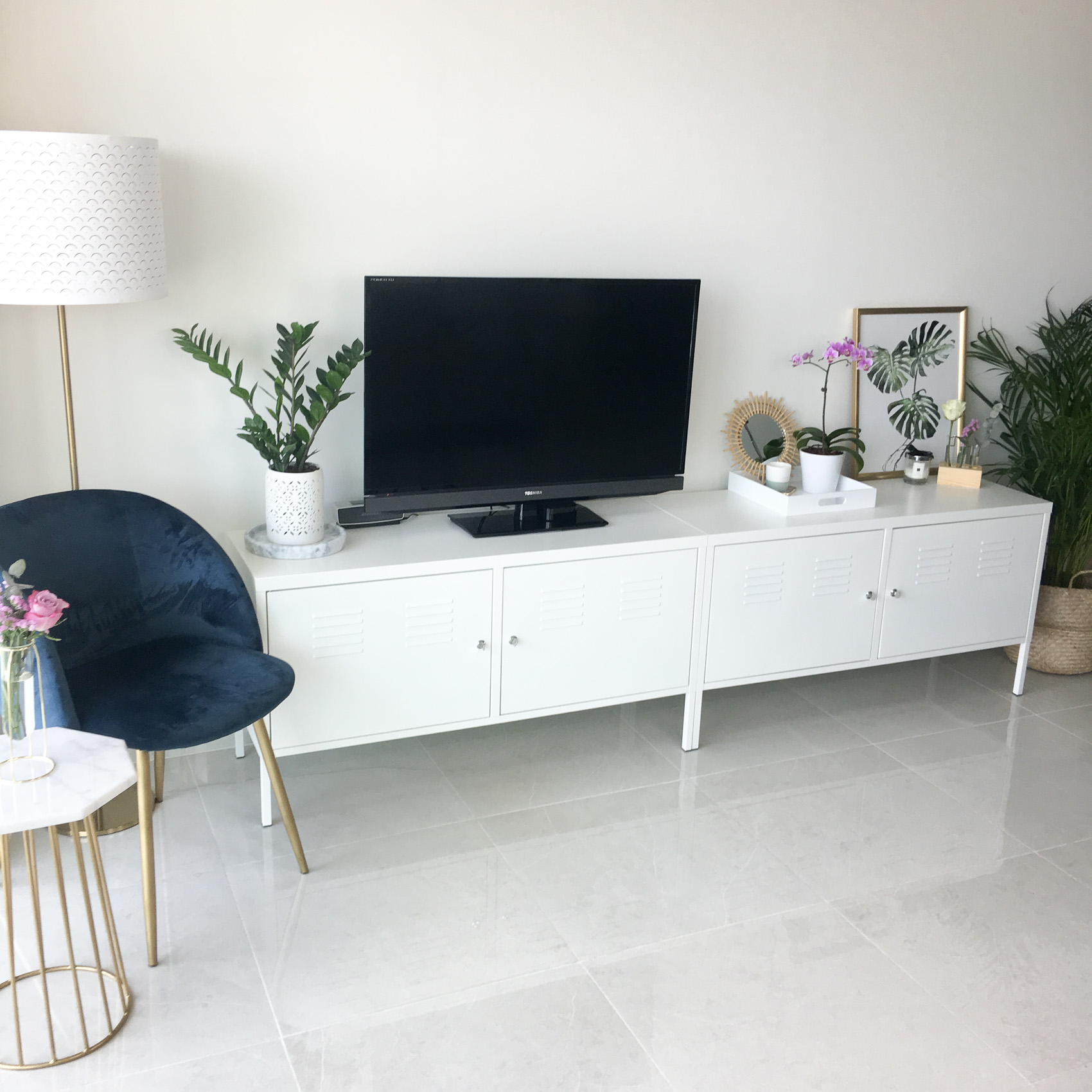
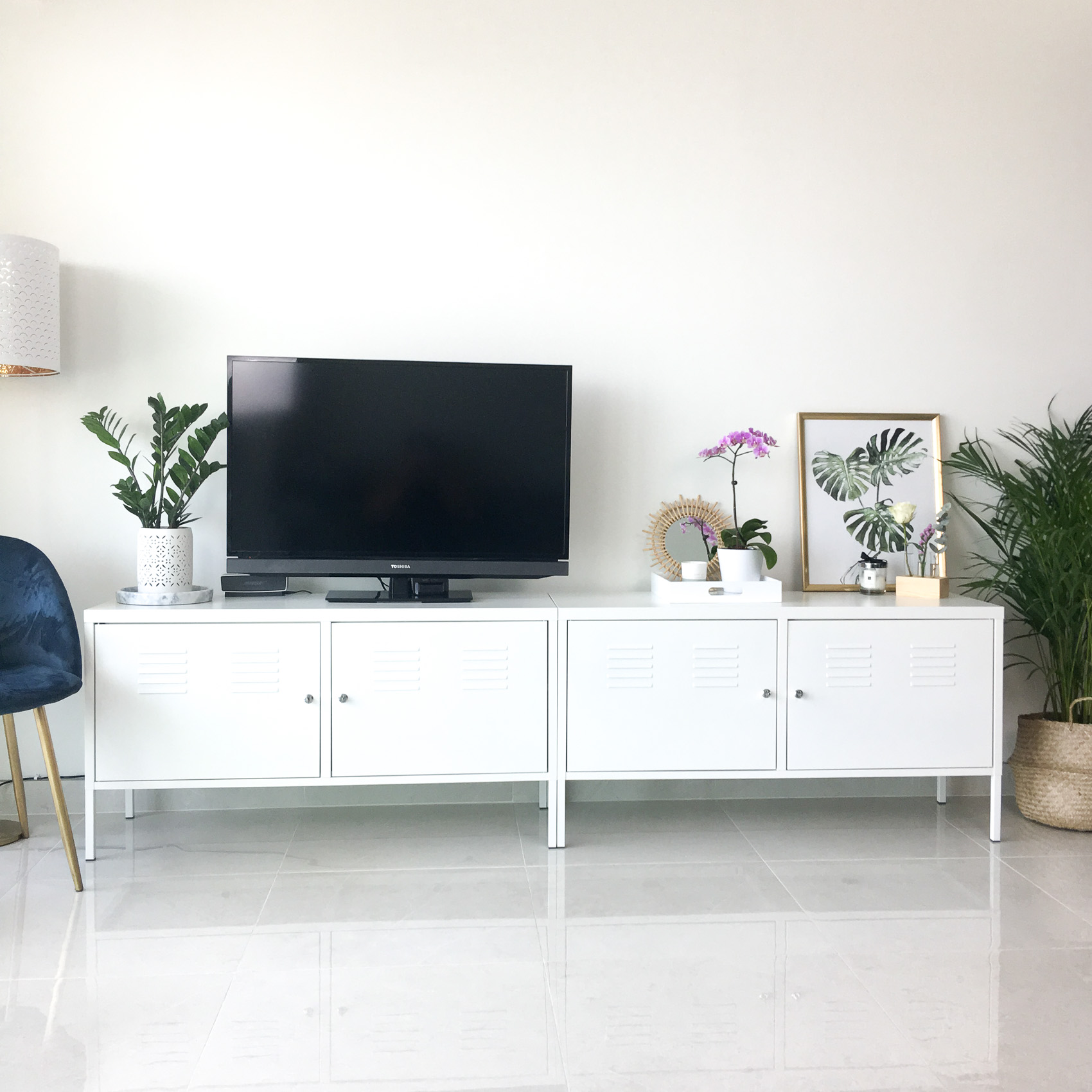
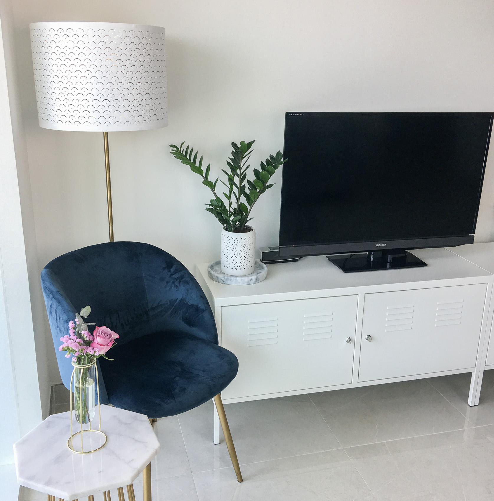
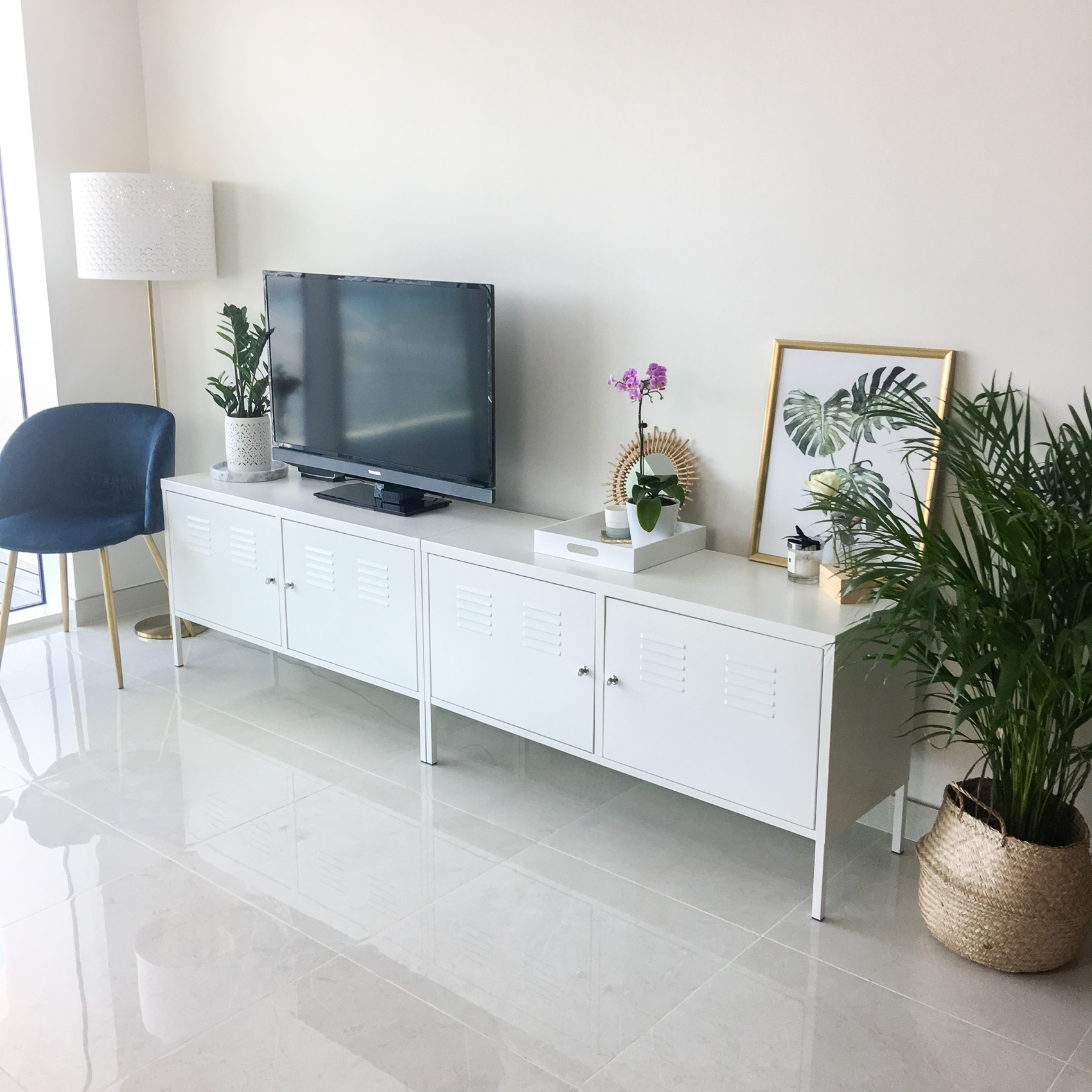
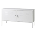
The TV unit that we had in our old apartment was a bit outdated and didn’t really go with the style of our new apartment, so we ended up selling it and replacing it with this Ikea PS Cabinet. This unit is actually from the office storage section in Ikea, but I really love how it looks as a TV unit in our living room. I think it really suits the style of our apartment and I love the simple and clean design. It also holds so much stuff, so it doubles up as a storage space which is such a plus when you are living in an apartment. We got two units and placed them side by side which meant we had room for the TV and then some extra space for decorating :).
In addition to looking nice and having lots of storage, these little cabinets are really affordable too. In fact, together they cost less than what I sold my old TV unit for so it was a win-win 🙂 I feel like I got a free upgrade lol.
Chair and Side Table
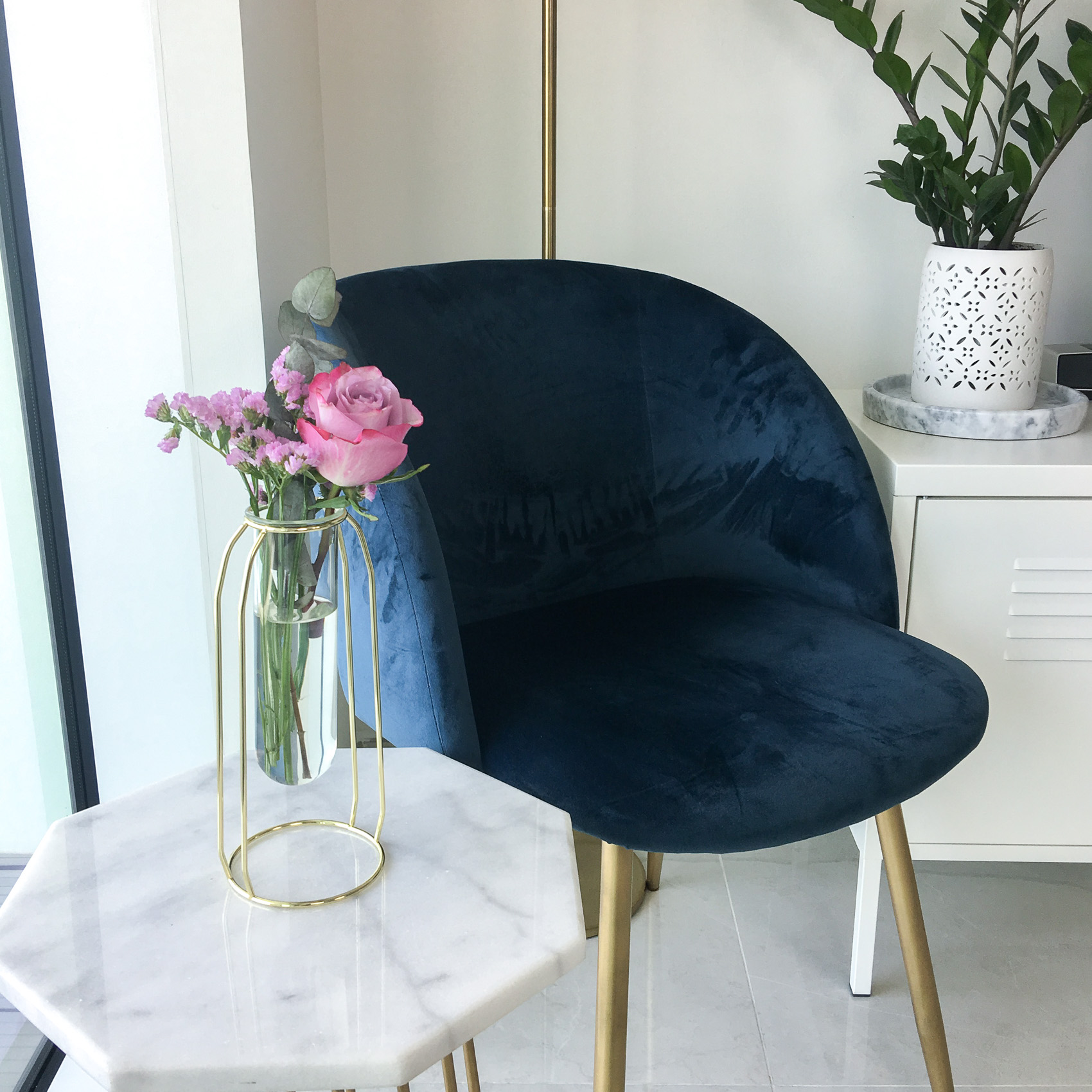
Beside the TV unit in the corner next to the window, we put my navy velvet chair from Søstrene Grene and my DIY marble table. I have spoken about both of these items in a previous blog post, so I won’t go into detail on these again, but you can read that blog post here if you would like to hear more about them.
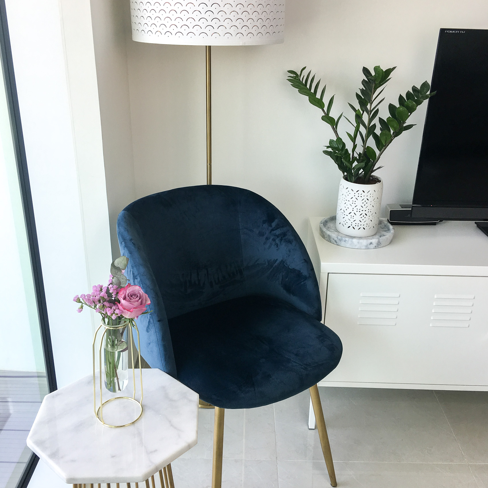
I think they look perfect sitting in this corner beside my tv unit. It is a nice coffee / reading corner and I love that it is beside the window because it is nice and bright :). Sometimes it is just nice to look out the window lol.
Lamp
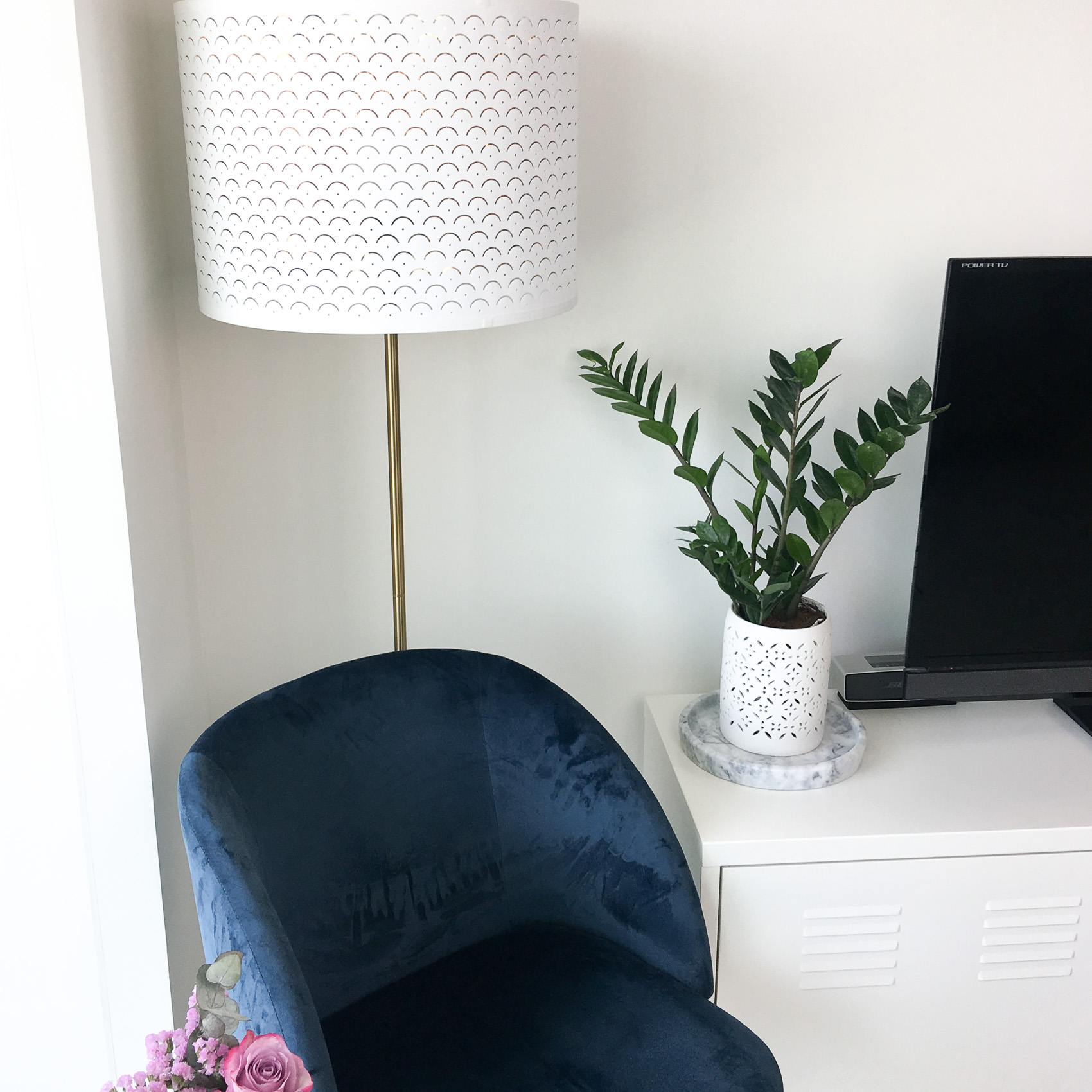
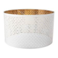
In the same corner, just above the chair, we put a Ikea NYMÖ Lamp shade with a gold base. I wasn’t sure how I felt about this lamp shade when I first took it out of the box. It has quite an unusual perforated design, with a brass / gold coloured lining. Once I assembled it and put it in place, I really liked it and I think it fits perfectly in that corner and completes the look. Because of the brass coloured lining it produces a very yellow toned colour when switched on, which seemed a bit odd at first, but we have really gotten used to it and I think the colour makes the room feel very cosy in the evening which is sometimes hard to achieve in an open plan space.
 Just a random side note – it really blows my mind how ikea manage to make absolutely everything flat packed. When I look at this lamp, I think how on earth does that go into a flat box without getting damaged. Of course Ikea have mastered it with this clever design whereby they roll the outer lining of the shade into a small, neat roll. The shade has got a number of little clips attached to it. They then provide two large circular rings. You have to then unroll your shade so that it is lying flat on the ground and you take the circular rings and roll them along the edges of the shade until they clip into place and voila, you have your undamaged circular lamp shade. I’m probably the only person on earth that finds this interesting lol but I thought I would share it anyway incase the thought ever crossed someone else’s mind (you’re welcome lol).
Accessories
The top of the TV unit is basically split up into a number of different sections – we placed the TV to the left of the unit. I prefer this unsymmetrical / off centred look rather than having the TV in the middle where you end up with two pretty useless spaces either side of it. With the TV positioned on one side it leaves the other side of the unit free to decorate and look pretty, which I think is often difficult to do with TV units. Let’s face it, TVs are pretty ugly if you ask me, but according to Dan “there are lots of nice ones, we just don’t have one of those” (no prizes for guessing what he is now eyeing up lol).
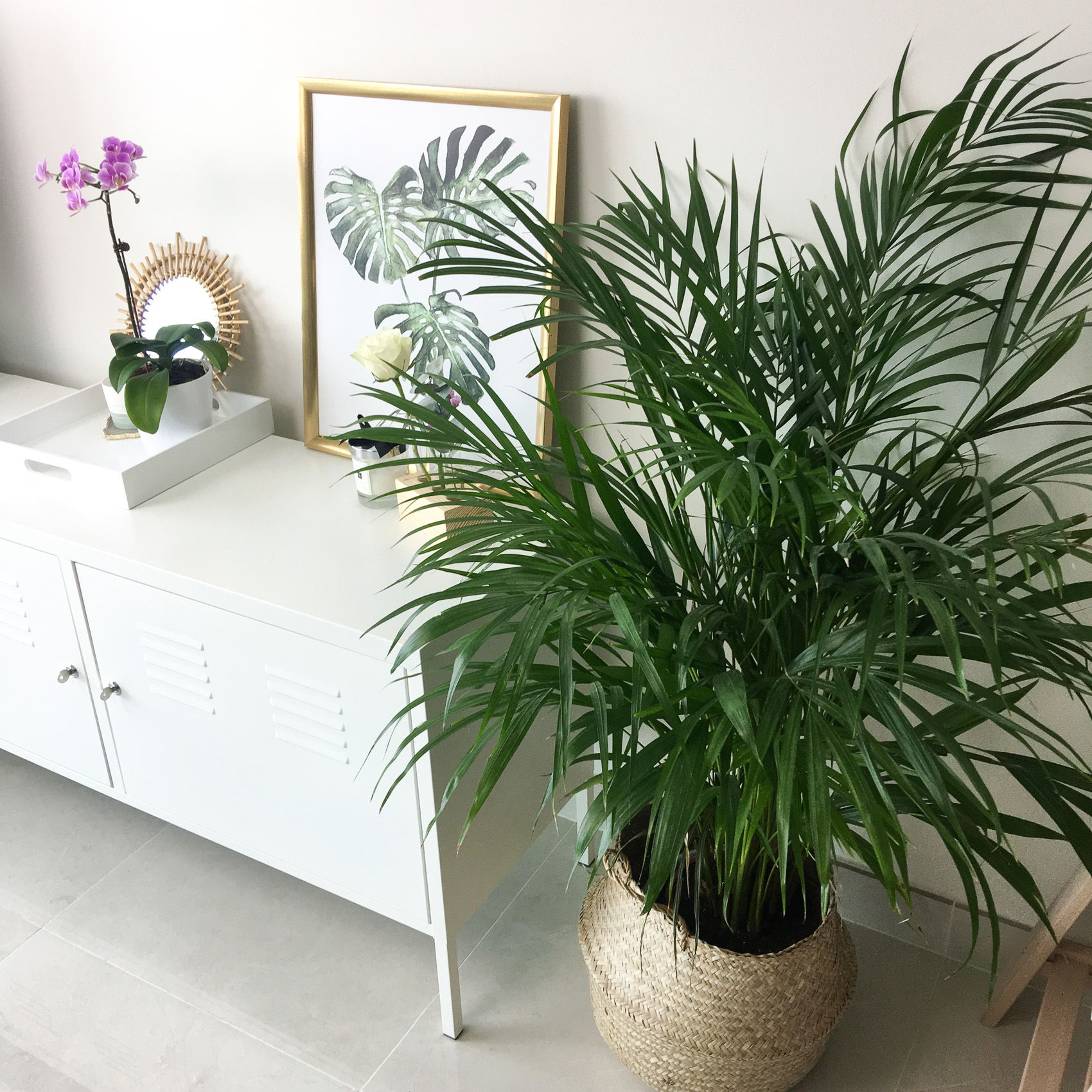
Immediately to the left of the TV is a little space for a plant of course. I placed the plant pot on top of this round marble tray which I got from an Instagram UAE store called Details Homeware that supply marble products.
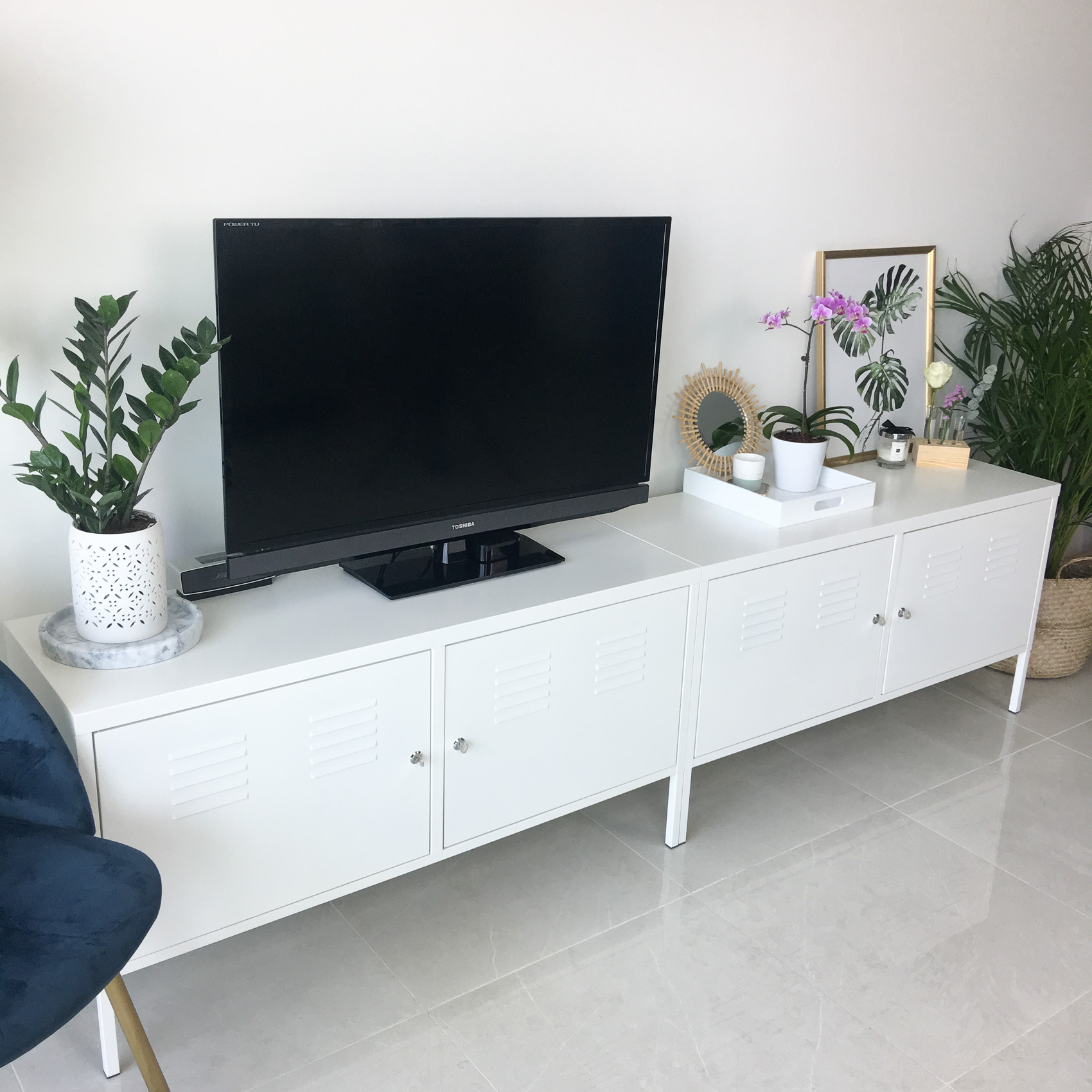
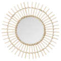
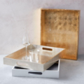
The area to the right of the TV unit changes ever so slightly on a regular basis lol but it pretty much always has the same ‘main’ things on it, which are generally a print, a couple of candles and a variety of plants / fresh flowers. Currently I have this white tray from West Elm and on it I have put an orchid (which I was not expecting to survive under my care (and in this white pot), but so far so good), a candle from H&M Home sitting on an Anthropologie coaster and a small round bamboo mirror from Maisons Du Monde that I think looks so cute just propped up against the wall.
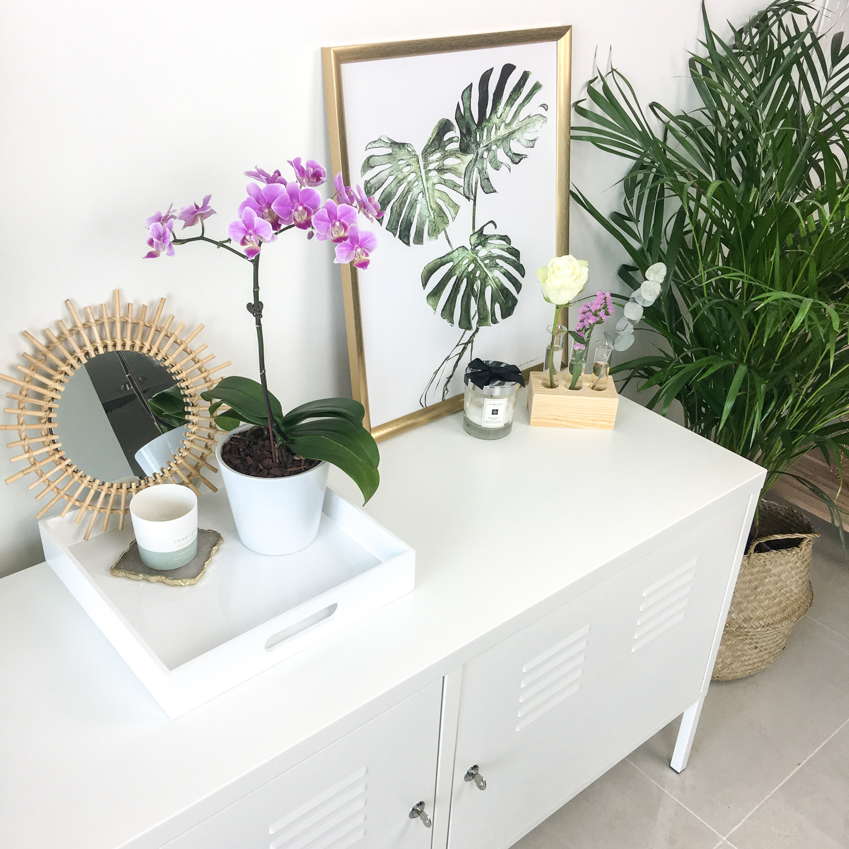
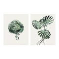
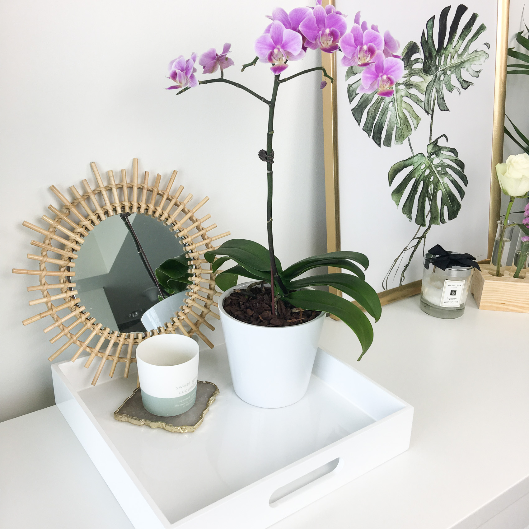 I then have a large print in a gold frame, both of which are from Ikea. I have recently ordered some new prints from Desenio so I’m sure I will do some moving around of prints at a later stage, but for now, I love this Ikea one here.
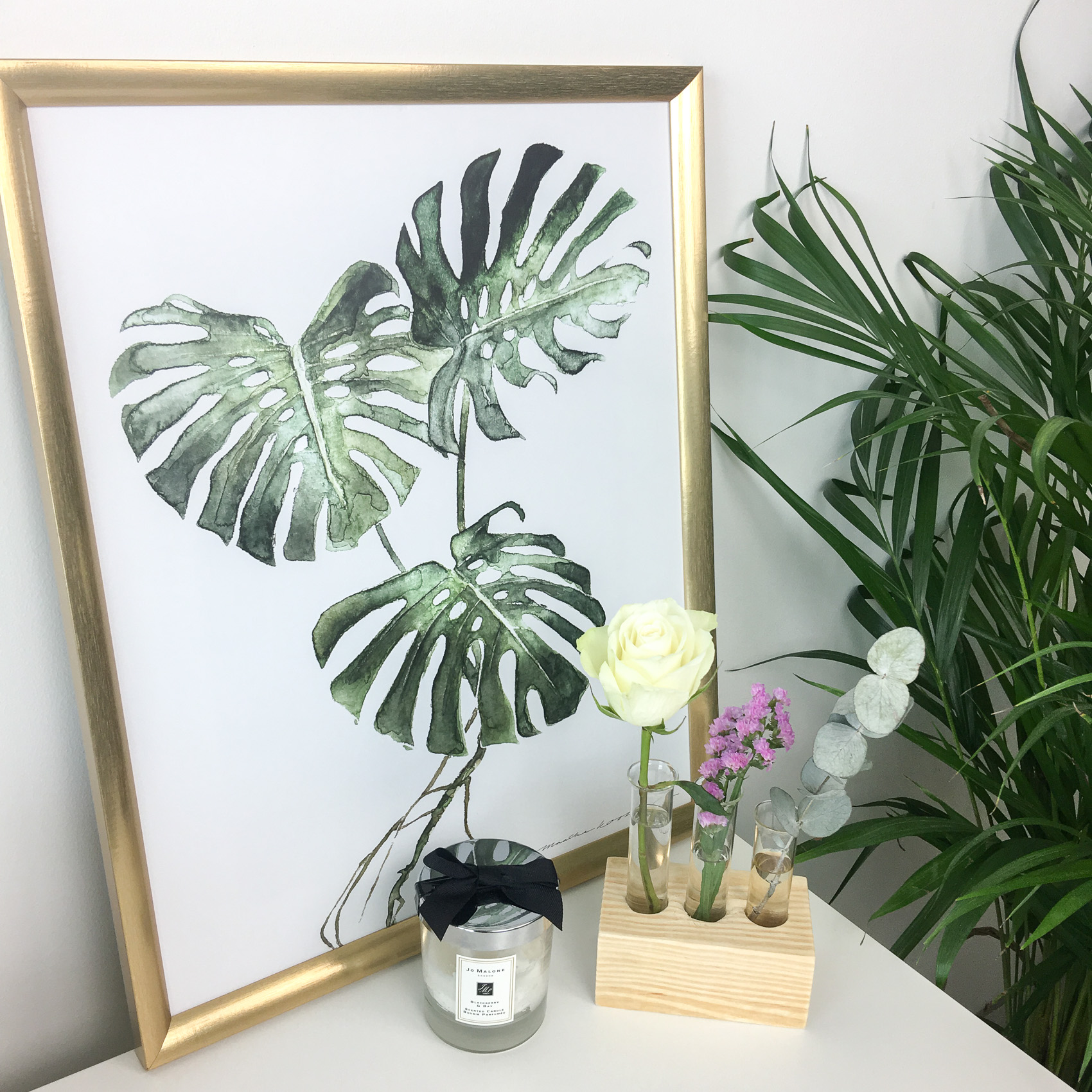
In front of the print I have this bud vase which I ordered from the online shop Jollychic. I absolute LOVE this! The design is so simple but effective. It is basically a little block of wood with three test tubes lol but I think it looks so pretty and I love changing what I put in it. I love how many different ways I can use it. Sometimes I will put three stems of flowers in it and other times I will just put little sprigs of foliage or mix it up with both like I have done in this photo.
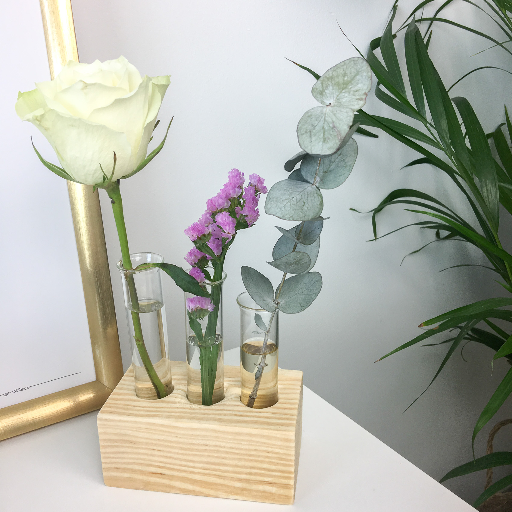
I can’t find the link to this exact one on their website but they have lots of different options. The vase that I have sitting on my marble side table is also from there.
Next to that I have one of my favourite Jo Malone candles (which I light sparingly lol)
That’s everything that is on top of my TV unit at the minute, but like I said, I love to chop and change things all the time and I am constantly rehousing things around the apartment 🙂
Plant
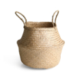
Last but not least is my plant which is in an Ikea FLÅDIS seagrass basket. I am obsessed with plants and we have quite a few of them around the apartment. I think they just make a space feel so fresh and bright. I use this one as a kind of divide between the living space and my desk lol and I think it works perfectly for that.
That’s it for my living / TV space interior update. I love writing these kind of blog posts so I hope you enjoy reading them. I have a few other interior blog posts coming up over the next few months but do let me know if there is anything in particular that you would like to see :).
Happy weekend everyone :).
SHOP THE POST

Your living space is gorgeous, looks lovely and light. IKEA is fab isn’t it! I love shopping there. I’ve got the same plant as you which I’ve had for 14 years, it’s. It doesn’t seem to grow in size? Must get a basket for it, I’ve seen this before and liked it.
Have a lovely Sunday!
Samantha x
https://thebeautyspyglass.com
Ah thank you so so much Samantha 🙂 OMG I LOVE Ikea! (my husband feels the opposite about it lol) WOW I can’t believe you have had that plant for 14 years!! That is seriously impressive! I will be happy if mine lasts a quarter of that time! lol mine doesn’t grow much either tbh, but I think that’s good – means we don’t need to re-pot it lol. Yep the basket is from good ole Ikea too 🙂
Hope you have a great weekend too 🙂 xx
This is absolutely gorgeous! Love your decor, Claire!
Oh thank you so much Jen. I really appreciate that 🙂 I love doing interior stuff so i am glad you enjoy reading it 🙂 xx